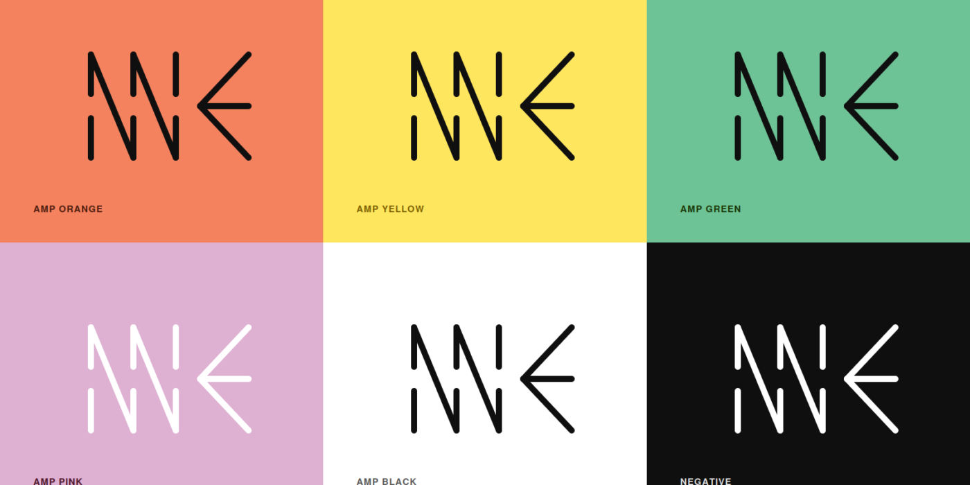
Every visual identity starts with a question: how do you compress everything a project stands for into a handful of lines? For SynAmp, that question was answered by designer Miloš Nikolić, whose mark now appears across the project’s website, publications, and tour materials.
The logo is built from three conceptual layers, each translated into a distinct visual element.
The first is support and connection — represented by three short vertical strokes, interrupted along a central axis. Their triple repetition is a quiet nod to the project’s three-year duration and to the creative partnerships formed along the way.
The second is collaboration and synergy — two parallel diagonal lines that break from the stillness of the verticals. Their shared angle suggests coordinated movement: partners working in the same direction, even while spread across nine countries.
The third is innovation — an arrow-like form that diverges from the rest of the mark, pointing toward the new pathways that emerge when composers, performers, and cultural professionals work together.
Together, these three elements form a single, modular mark: thin, linear, and adaptable across formats — from a small favicon to a full-bleed festival banner. The logo comes in two versions: a compact symbol for use within the brand’s own visual system, and a version paired with the “Syn Amp — Synergy Amplified” wordmark for use elsewhere.
It’s a small piece of design, but like the project itself, it’s built from simple, repeated elements that only reveal their full shape when they come together.